

Why Graphics Matter Today
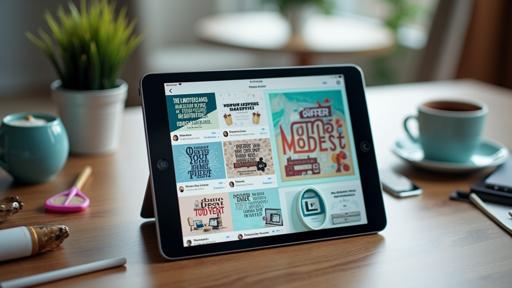
Every day, billions of posts compete for attention on social media platforms, creating an endless stream of content for users to scroll through. Visual content stands out in this sea of information, getting 94% more views than text-only posts.
Most small businesses know they should post regular graphics on social media, but they struggle to find the time to create them. Their team members often lack design skills, making it hard to produce professional-looking visuals. Even when they do create graphics, maintaining consistency across all their social media channels proves challenging.
Quality social media graphics can boost your engagement rates significantly, helping your posts stand out and get noticed by more potential customers. Consistent, well-designed visuals also make your brand more memorable, making it easier for people to recognize and trust your business.
Essential Design Elements
Your social media graphics need strong visual elements to catch attention in busy social feeds. These key elements include balanced composition, clear hierarchy, and consistent branding that helps your content stand out.
Colors, typography, and white space work together to create an emotional connection with your audience. The right color combinations can trigger specific feelings and responses, while clean typography ensures your message is easy to read. Proper use of white space helps guide the viewer's eye and prevents your graphics from looking cluttered.
Many beginners make their graphics look unprofessional by cramming too many elements into a single image or using too many different fonts. You can avoid these pitfalls by sticking to a simple design with plenty of breathing room and no more than two font families per graphic.
Platform-Specific Dimensions
Using the right image dimensions makes your social media posts look polished and professional. Getting the sizes wrong can result in cropped, stretched, or pixelated images that hurt your brand's credibility.
Your social media graphics need specific dimensions for each platform in 2024: Instagram feed posts work best at 1080 x 1080 pixels square, while Facebook posts should be 1200 x 630 pixels. LinkedIn posts perform well at 1200 x 627 pixels, and Twitter posts need 1600 x 900 pixels for optimal display.
To keep your images looking sharp across all platforms, save them in PNG format for graphics with text or logos, and JPG for photos. You can create one high-resolution master image and resize it down for different platforms, but never stretch a smaller image to fit larger dimensions.
Brand Consistency Tips
Your social media graphics are often the first impression people get of your business, making brand consistency crucial for instant recognition. When your visuals maintain a consistent look across all platforms, you build trust with your audience and make your content immediately identifiable.
Creating a visual style guide doesn't have to be complicated - start by defining your brand colors, fonts, and logo usage rules. Keep this guide in a shared document that's easy to access and update as your brand grows. Make sure to include examples of correct and incorrect usage to help your team understand the guidelines better.
You can adapt your brand elements for different content types like stories, posts, or reels while keeping your core visual identity intact. The key is to maintain your brand colors and typography choices even as you experiment with different formats and layouts.
Content Types That Convert
Social media platforms support various graphic formats, from eye-catching infographics and carousel posts to quick-hitting stories and reels. Each type serves specific purposes, with infographics being perfect for explaining complex data and carousel posts ideal for product showcases or step-by-step guides.
Your business goals should guide your choice of graphic content, with infographics driving more shares and saves when you need to build authority in your field. Video content like reels tends to get the highest engagement rates when you want to increase brand awareness, while carousel posts often lead to better conversion rates for product launches. Stories work best for time-sensitive promotions and building personal connections with your audience.
You'll see better results by matching your graphic style to what your specific audience segment prefers, whether they're busy professionals who appreciate quick-to-digest infographics or younger users who engage more with dynamic video content. The key is to test different formats with your audience and adjust your approach based on their engagement patterns.
Text and Image Balance
Finding the right balance between text and images in your social media graphics can make or break your engagement rates. A cluttered design with too much text can overwhelm your audience and lead to lower interaction rates, while the right text-to-image ratio helps your message stand out.
The famous 20% text rule, originally introduced by Facebook, suggests that ad images should contain no more than 20% text to maximize their effectiveness. While this rule is no longer strictly enforced, ads with less text still perform better and reach more people. Your ads are more likely to resonate with audiences when you keep text minimal and let your visuals do the talking.
You can work around text limitations by using overlay text strategically in empty spaces within your image or incorporating text as natural elements in the scene. Try using environmental elements like signs, screens, or product packaging to display your message without making it feel forced.
Visual Hierarchy Mastery
Visual hierarchy is the arrangement of design elements in order of their importance. Your design's success depends on how well you guide viewers through information, just like a good story needs a clear beginning, middle, and end.
You can create effective visual hierarchy by making important elements larger or bolder than others, using contrasting colors to highlight key information, and strategically placing crucial elements where eyes naturally land first. Empty space around important elements makes them stand out more clearly, while grouping related items helps viewers understand relationships between different pieces of information. The positioning of elements, such as placing primary content at the top or in the center, naturally draws attention where you want it most.
Many designers make the mistake of giving equal weight to all elements, creating visual noise that confuses viewers. You can avoid this by picking just one to three focal points per design and making sure everything else plays a supporting role.
Time-Saving Design Systems
Creating graphics that look the same across all your marketing materials can feel like a never-ending task. You often spend hours making sure every social media post, presentation slide, and email banner matches your brand style perfectly.
A good design system with ready-to-use templates will save you countless hours of work. You can set up basic layouts, color schemes, and font combinations that you'll use again and again. Your team members can then simply pick a template and fill in the new content without worrying about breaking your brand guidelines.
Modern design tools can help you speed up repetitive tasks with automation features. You can create rules for automatically sizing images, applying brand colors, or updating text styles across multiple designs at once.

Analytics and Optimization
Tracking how your social media graphics perform helps you understand what catches your audience's attention. You can use the built-in analytics tools on social platforms to see which posts get the most engagement.
The main numbers to watch are likes, shares, and saves, as these show different levels of connection with your content. Comments give you direct feedback about what your audience thinks, while the time spent viewing your graphics shows if people stop to look at the details. The reach and impression numbers tell you how many people actually see your posts.
Your data will show clear patterns about which colors, styles, and content types work best with your audience. You can use these insights to adjust your future designs and create graphics that your followers want to engage with.
Common Graphics Questions
How often should I post graphics on my social media?
You should aim to post graphics 3-4 times per week on each social media platform. This frequency helps maintain consistent engagement without overwhelming your audience or compromising content quality.
What do I need to know about copyright for my graphics?
Always use images you have rights to, either by creating them yourself, purchasing them, or using free stock photos from sites like Unsplash. If you use stock photos or templates, check the license terms carefully and keep records of where you got your assets.
How can I ensure my graphics look good on mobile devices?
Test your graphics on multiple devices before posting them to social media or your website. Keep text large enough to read on small screens (minimum 16pt font) and use high contrast colors to ensure readability.
When should I outsource my design work?
Consider outsourcing when you need specialized graphics like logos, brand guidelines, or complex infographics that require professional expertise. You can handle basic social media graphics in-house using simple tools like Canva, but invest in professional help for graphics that represent your brand long-term.